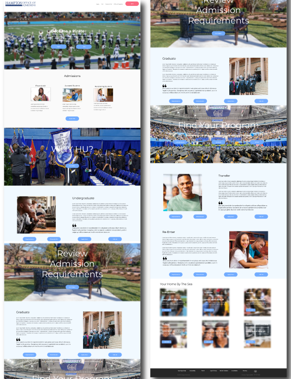
Design an Admissions page that clearly defines the message and history of the University. In addition to that, a work flow that simplifies the users task in enrolling as a prospective student or a returning student. The old page is due for a much needed update and refresh. The objective of the refresh is a holistic strategy to increase enrollment for the University.
Design an interactive website that allows students to easily apply for enrollment and programs. Clearly defines the role of the programs and department. Highlight program achievements accolades and historical data.
Landing Page
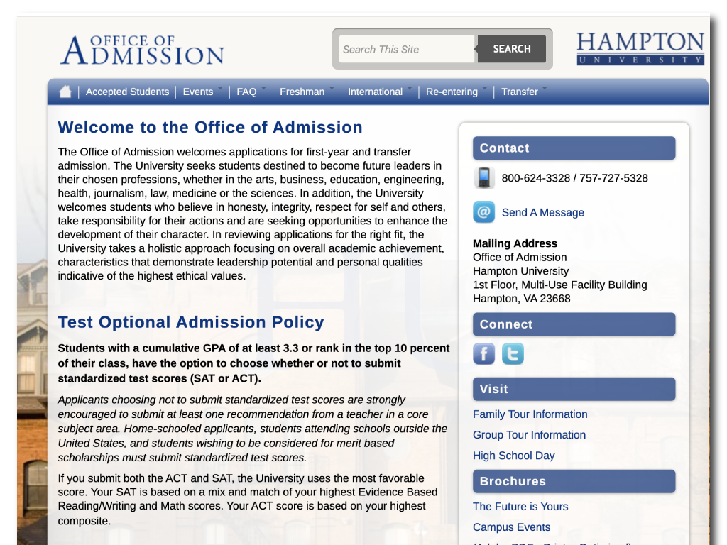
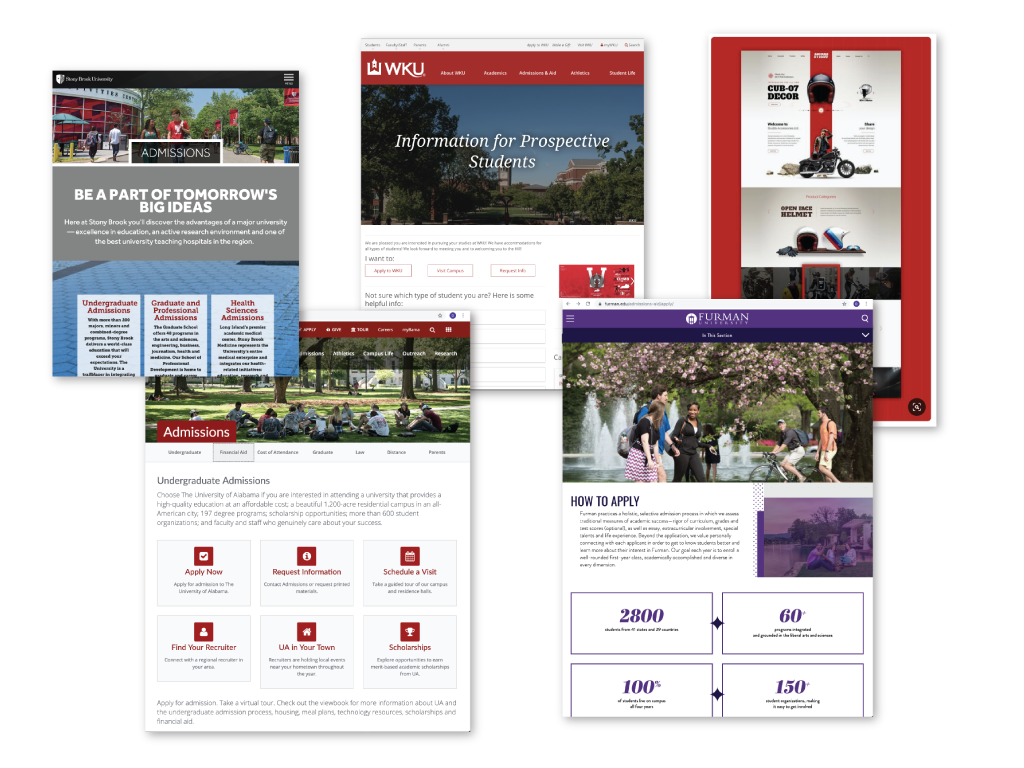
After learning more about the application process I began to see the many pain points students were having in completing just simple task. I began to review other institutions of learning and studying how they approach the application process. How they organized there information and the journey students took to accomplish task.
This project will require very detailed research. In my initial meeting/Needs assesment I will ensure i gather the business requirements from the client. Specifically, what would they like the user to accomplish. Secondly, user interviews will be critical to capture the "pain points" of the users.
This information will assist me in creating wireframes and task flows. The navigational structure will be robust and large. Site map and content audit will be critical as well..
Display it in full size:
In this case, the problem was getting users to complete the application process. Defining the obstacles users are combatting is the key to meeting the clients business needs. The solution, creating a task flow with clear "CTA's" that guide the users through the process. I’ll build an inspirational mood board, sketch out ideas and build wireframe task flows that solves for user requirements.
Display it in full size:
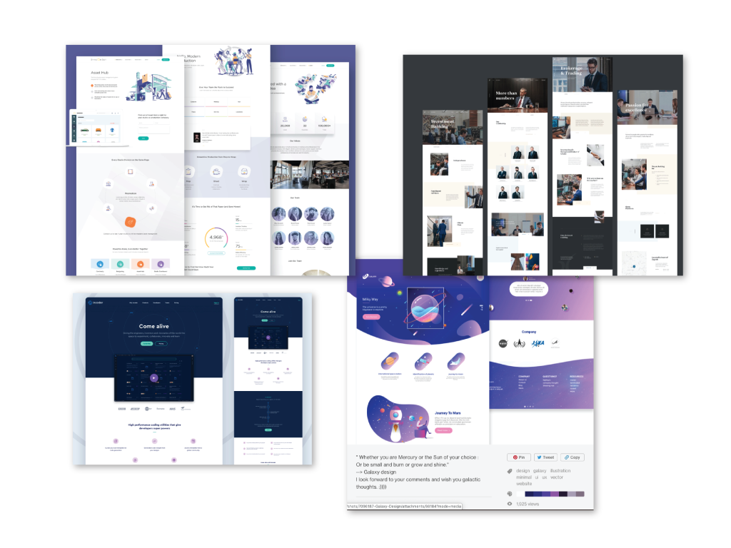
To help establish the basics and a baseline I made a mood board. Mood boards are very fluid and allow for colloboration. In my research I need to find examples of landing pages that organized large amounts of information effectivly.
Display it in full size:
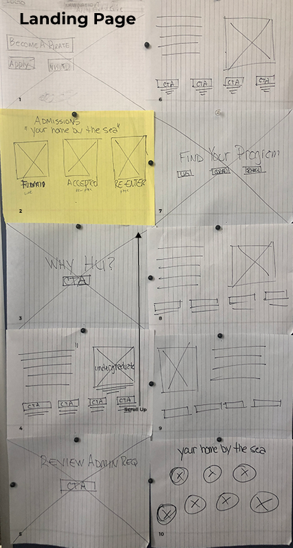
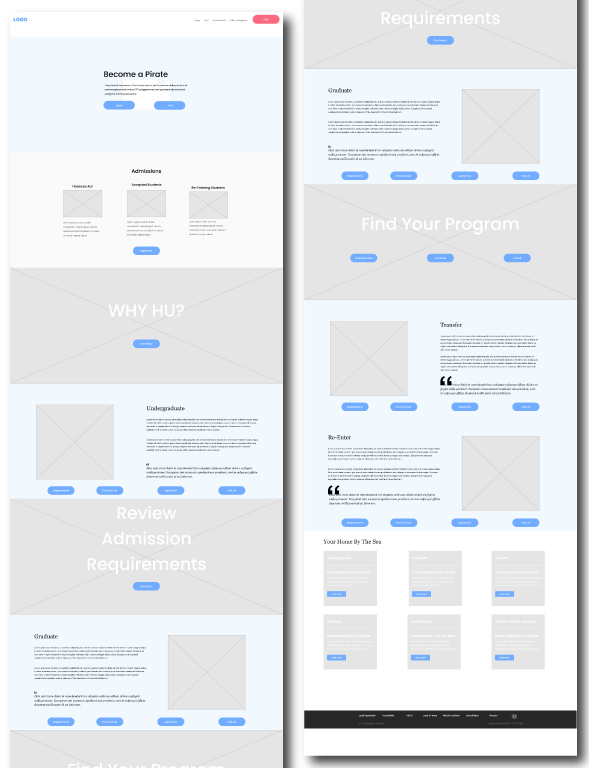
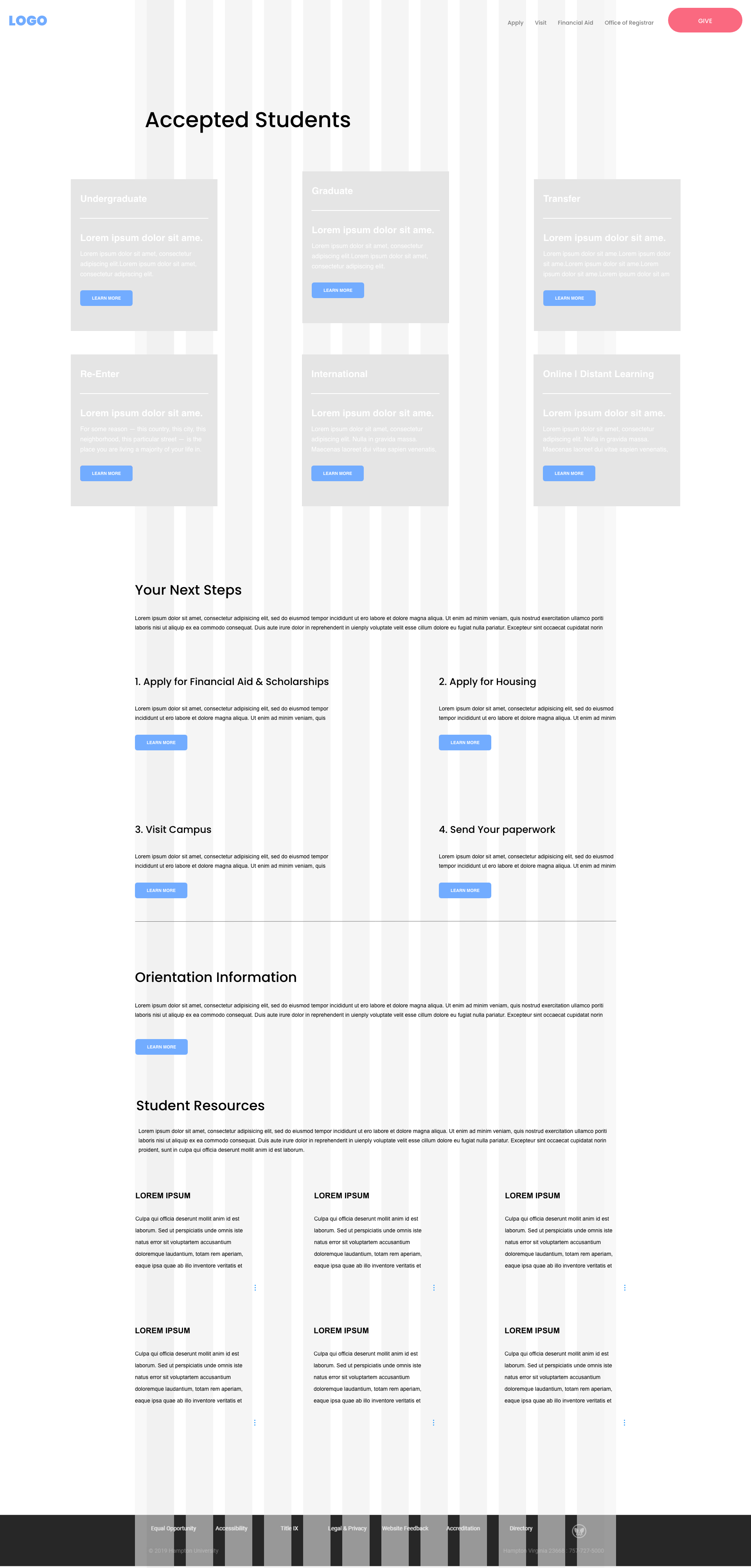
Wireframing will be used to explore the user experience.The wireframing will help identify a more efficient user flow for the user. In this project I want to ensure users know exactly what they need to do.Implememting strong CTA's and a visual design that will guide them through a familiar application process.
Display it in full size:
Understanding that the user is very task oriented my goal is to ensure that information is readily available. I also want to make the process memorable and learnable. From my researsch and interviews I learned that the users will be returning to the page frequently. If the user is not satisfied and can efficiently accomplish their goals, the new site will not be successful.
Display it in full size:
This project begin to take on a life of its own as we began our researsch and audit of pages. Gathering information and business requirements from the client I found to be a good opportunity to ensure I was asking the right questions. I learned as a UX Designer, I need to ensure that in my initial meeting and and needs assesment conversations. I am listening and understanding. New issues did come up through research and testing. However, we were able to manage expectations with our client because we kept the lines of communication open.