Ui/Ux Engineer

Derrick Rea

Case Study #1


Website Audit and Redesign

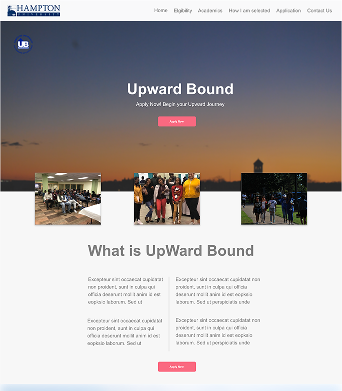
The Upward Bound homepage was in definite need of a major facelift. Considering the age of the site the BEST option was a complete redesign. A clear expectation was to communicate the programs vision and goals to the end user in a way that engaged new users and satisfied returning users. Meeting with the Program Director a clear goal was to communicate the mission and purpose of the program much clearer.

  • Team Project | Lead on UI/UX

  • Tools: Adobe XD, Adobe Illustrator, Adobe Photoshop
  • Car


Empathize

EMPATHIZE (Objective)

Design an interactive website that allows students to easily apply for programs that are being offered. Clearly defines the role of the programs and department. Highlight program achievements accolades and historical data.Reviewing the 1 page site it was clear that there was an abundance of information that could be shared with future applicants and students

Web Image

Landing Page


The Problem

After learning more about the program I began to review other institutions of learning and studying how the same programs are reaching out to their students. Collecting additional data from the client I attempted to narrow down the pain points she encountered engaging students. I compared that with students that were currently enrolled and past members.

  • 1st Observation

  • The message about the program was not being clearly communicated. Students and visitors alike had no cause to investigate or be curious about the program
  • The rich history of the program or the legacy was not being utilized as a tool draw new members in.
  • 2nd Observation

  • There was no imagery or visual content to tie in the activities and opportunities of members of the program. Page was content laden and had no CTA's to energize or encourage enrollment.
  • There was no substatial program information or service offerrings
Web Image


Define

DEFINE

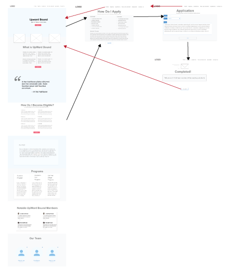
After gathering information from research and discussing business requirements with the client. I can begin my task flows and wire-framing

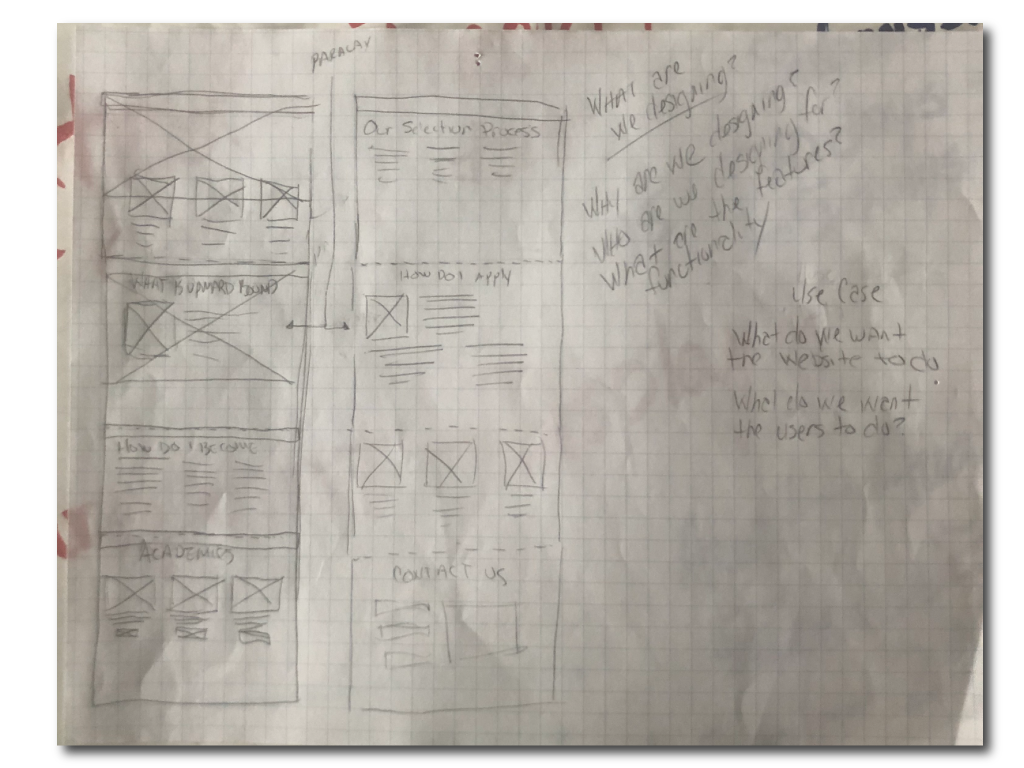
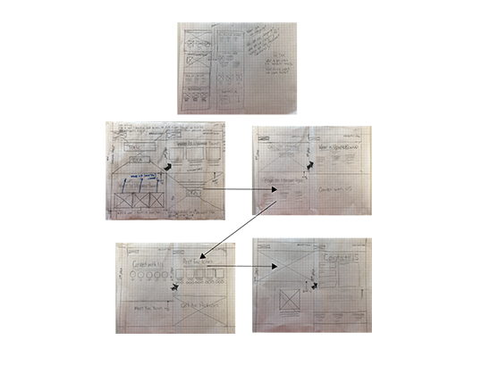
Wireframes and task flows will assit in solving for user requirements. This will help me in creating my navigational structure. A site map will help with the content audit.In this case, originally there wasnt much content so this allowed us to add additional useful content. We want to clearly define roles and programs.

Display it in full size:

Flow Chart
×
Flow Chart
Web Image


Ideate

IDEATE


Design/Plan Research

In this case, the problem was getting engagement from users and relaying the story and message of this program. Explaining why it is important, its impact on future students and its rich history. The solution, creating a very visual "Landing page" that displayed events/functions and also leveraged some the historical data of the University and weave it into the "CTA's" and content. So in this next step it involves the design planning and research. In this phase, I’ll build an inspirational mood board, sketch out ideas and build wireframe task flows that solves for user requirements.

Display it in full size:

×

Display it in full size:

×


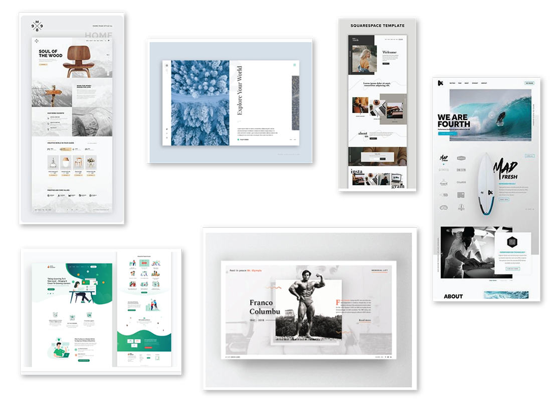
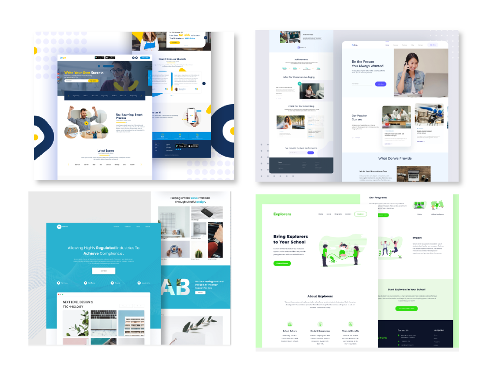
Mood Boards

To help establish the basics and a baseline I made a mood board. Mood boards are very fluid and allow for colloboration. In my research I wanted to find a theme or idea that allowed for communication through images that engaged users and encouraged interaction. As a team we felt a single landing page that allowed a fluid flow of images and strong CTA's would be a good start.

Display it in full size:

×

Display it in full size:

×


Low-Fidelity

Then I created a wireframe of the landing page. I created sections that were user focused and still answered the business needs of the stakeholders. Programs, elgibility and selection process, stood out as pain points that we wanted to address more clearly. I also simplified and made it clear immediately what the program is about.

Display it in full size:

×

Display it in full size:

×
Web Image


Prototype

PROTOTYPE


Solution

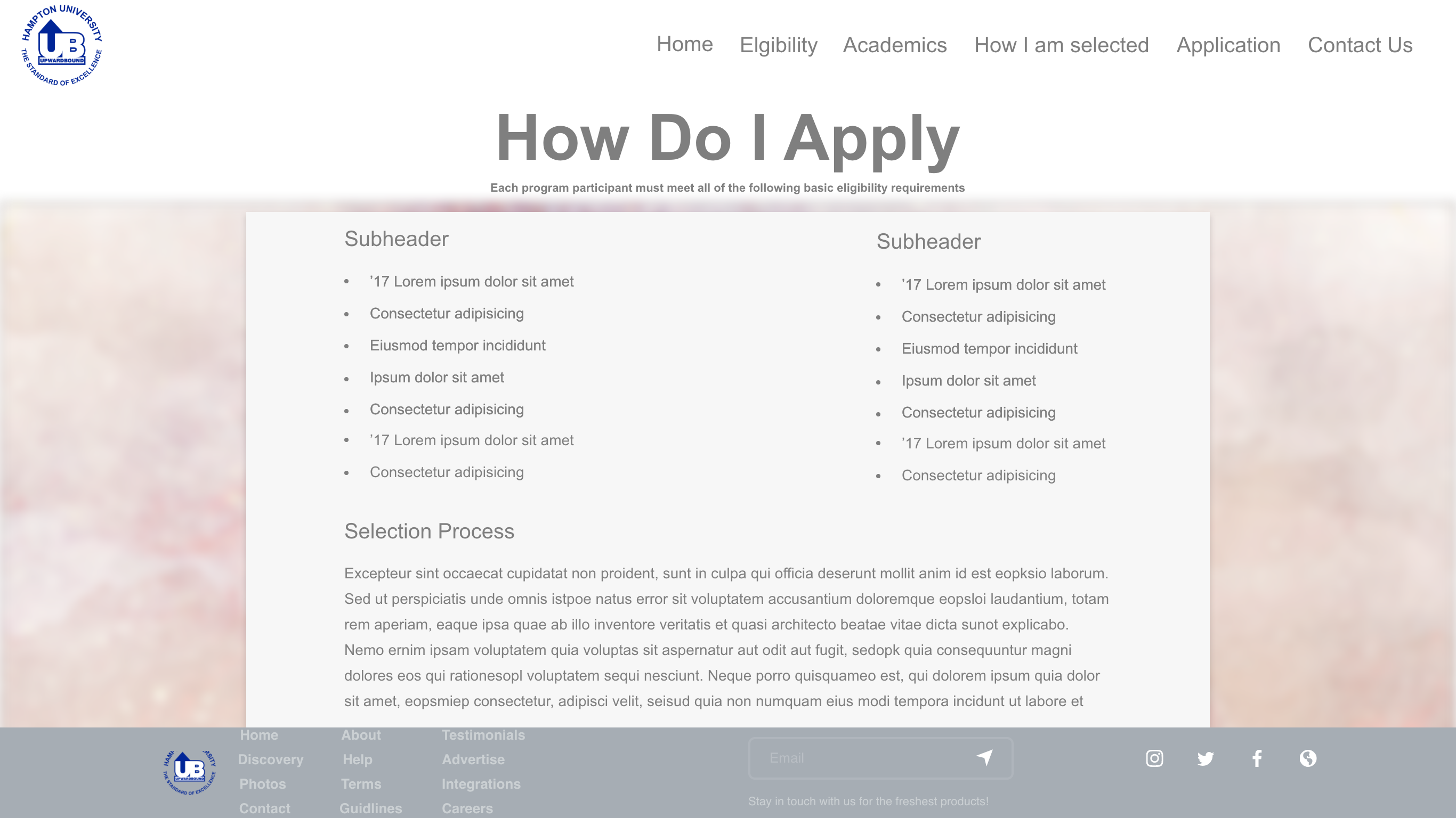
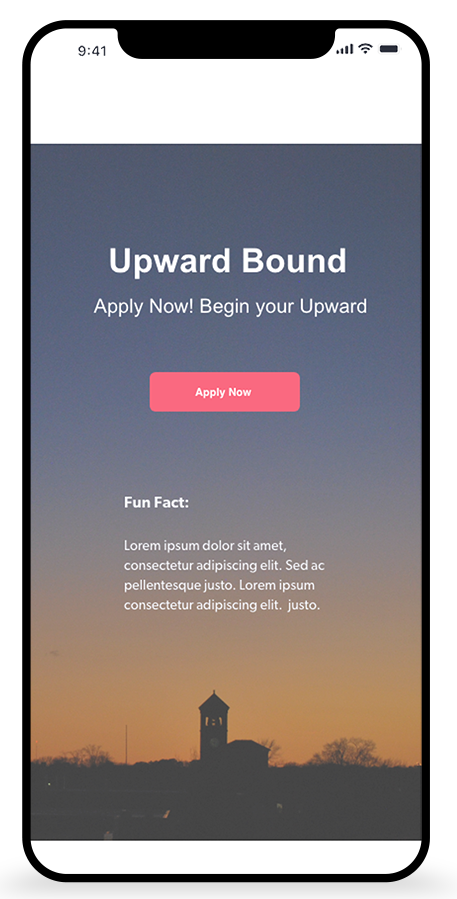
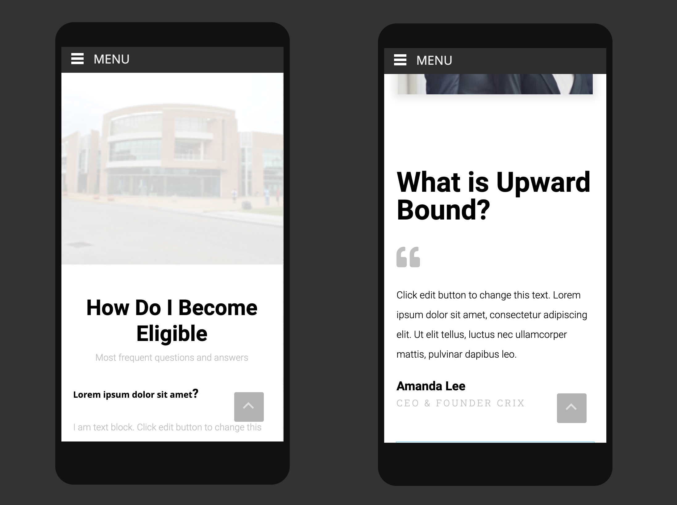
Create an easy to use website solution that allows students to quickly apply for programs offered by the department. The solution should be simple, easy to use and streamline the process. The solution will also allow potential members to learn about the offerings of the program as they peruse the landing page. For example, we will have "Fun Facts" that are quick tidbits of pertinent information that directly relates to the users interest and needs.

I created sections that were about the programs, elgibility and the history of the university. I created a single landing page with a "one stop shop" mentality.

Display it in full size:

×

Display it in full size:

×


Test

TEST


Validate and Implement

  • The stakeholders remained active during the process and offered consistent feeback to all solutions during development

  • A few call outs included:
  • Change in the font selection. We had a few options that fall within are style guide
  • The addition of some possible .pdf files
  • The addition of some possible .pdf files
  • Additional imagery for gallery

TAKE AWAYS / WHAT I LEARNED


Take Aways.

  • I was able to use my skills to meet my clients needs

  • Time constraints kept us from:
  • doing more interviews with end users
  • Implementing an SEO strategy to measure new visits and impact of the new development.
  • Larger resource for program related imagery

What I learned.

The process of enhancing user satisfaction is by improving the usability and accessibility. Working on this project I was reminded how important research is. Especially gathering information from younger users that are about getting information quickly and effectively. I learned as a UX Designer, I need to always think beyond design. Be agile and adapt when new issues come up through research or testing. Always remember to keep user AND business goals in mind. Know the business of design is critical.